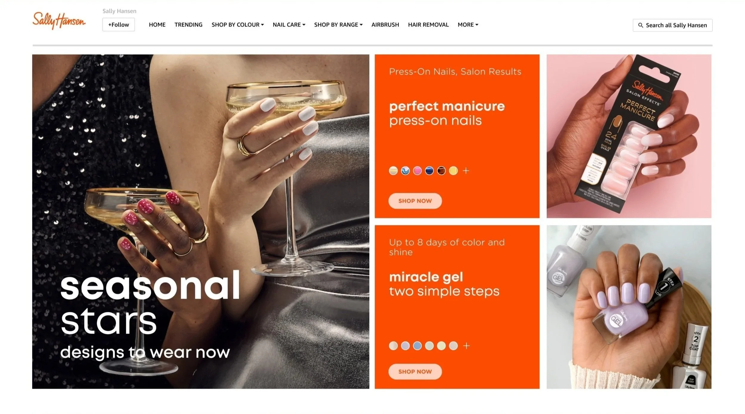
Sally Hansen
An established global beauty brand, Sally Hansen beauty products aredistributed in over 55 countries worldwide. With products spanning 5 beauty categories: nail colour, nail care, sunless tanning, hair removal, and beauty tools, Sally Hansen products create a Salon at Home model.
Client
Agency
Cult Ldn
The brand was looking to boost sales and awareness of salon-at-home products on the Amazon Storefront. I was approached by Agency Cult Ldn to create UI solutions for the brand’s Amazon Store with the aim to deliver 16 templates covering all franchises of the Sally Hansen brand ensuring it is a pivotal E-Comm site that works harder to deliver further sales and awareness to all customers in FY24 Q1/2 and beyond.
From UX to UI
Key Moments -Tap into key calendar moments, cultural events and spotlight product launches.
Navigation - Reduce scrolling and easily guide customers through the site.
Message Architecture - Distinguish the hierarchy of messages and consider how best speak to the customer.
Social Prospecting -How can SH be more relevant and bring the store-front in line with social trends.
Challenges
Working within Amazon’s storefront environment introduced additional constraints. Grid specifications had been informed by existing live storefronts rather than formal documentation, while proposed features such as carousels and PDP sub-navigation weren't consistently supported across Amazon experiences. This meant balancing the original design intent with the practical limitations of the platform, adapting the UI where necessary to create a solution that was both visually considered and realistic to implement.
Takeaways
With a fast transition from UX into UI, the project moved quickly into high-fidelity design. In hindsight, an initial cross-functional kick-off would have helped establish clearer roles, responsibilities and expectations from the outset.
It reinforced the value of early alignment, particularly when working across disciplines. On future projects, I would prioritise bringing the wider team together at the start to clarify ownership, surface constraints and create a shared understanding of how we would work together.
Phase one of the project established the core experience through UX wireframes. I joined for phase two, taking these foundations into UI and developing them into a cohesive, flexible visual experience for the Sally Hansen Amazon storefront.
The UX provided a strong structural starting point, while the transition into UI highlighted several areas that needed further consideration. Modules had initially been designed around assumed content, so layouts needed to adapt to real-world variations in copy, imagery and messaging. I refined these components to create greater flexibility while maintaining visual consistency across the experience.
With no overarching type scale or established design system in place, I also developed a clearer visual hierarchy and a more consistent approach to typography, spacing and component behaviour.