Talamo
Talamo is an evidence-led SEND assessment platform that helps schools identify learning needs, understand patterns across pupils, and plan better support. The product builds digital assessments that help schools identify learning needs, understand pupils more clearly and plan effective support.
Client
The brand was looking implement a second phase to expand the existing product, introducing new functionality to support screening for ADHD and dyscalculia.
From UX to UI
Key Moments
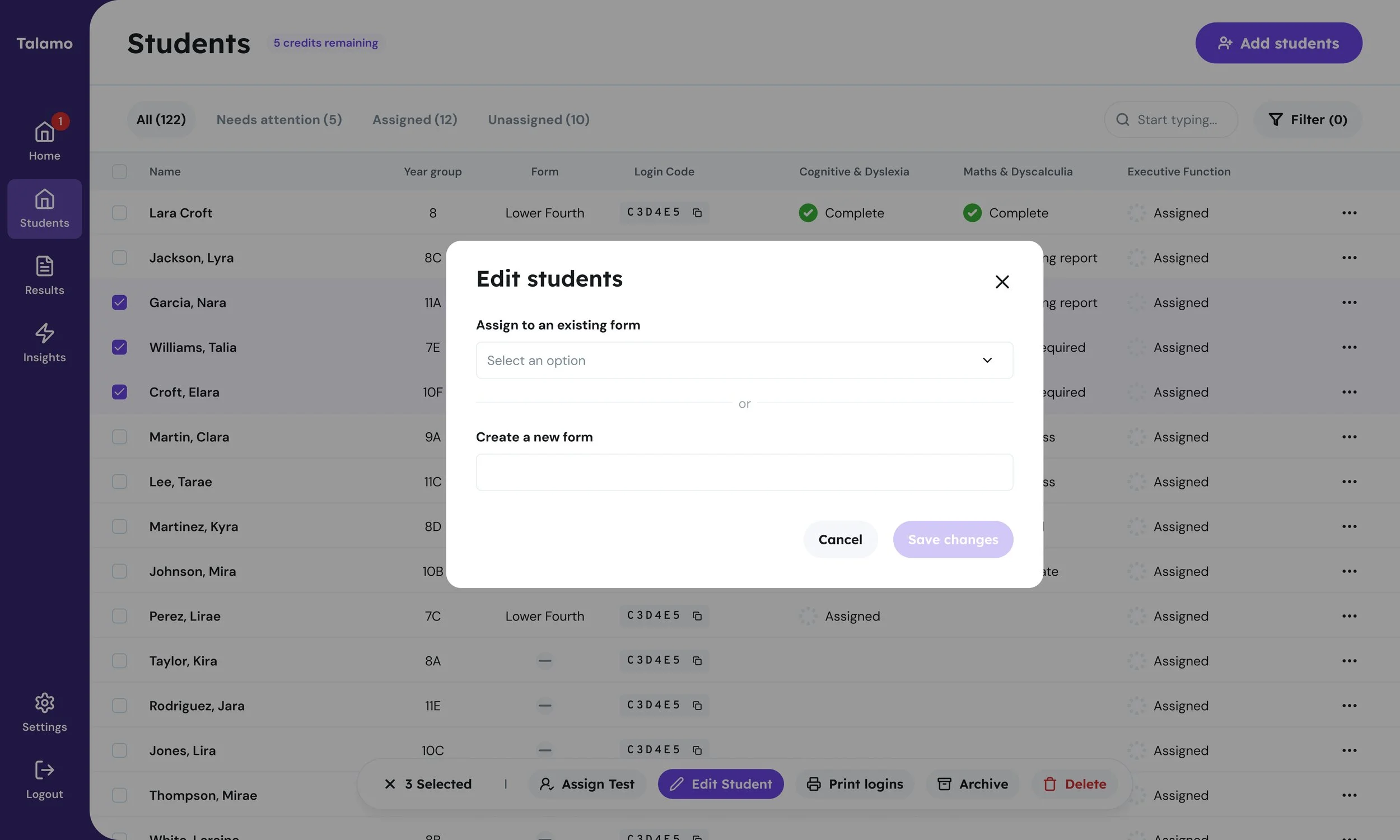
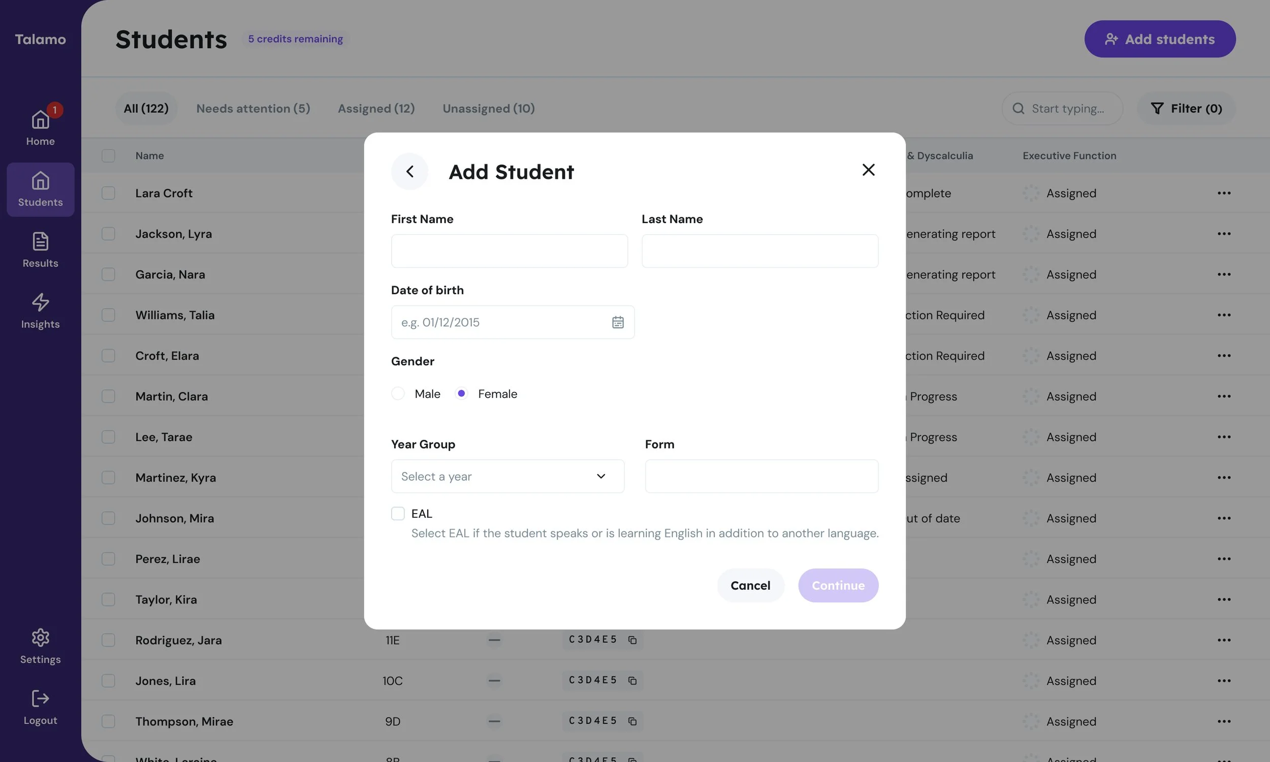
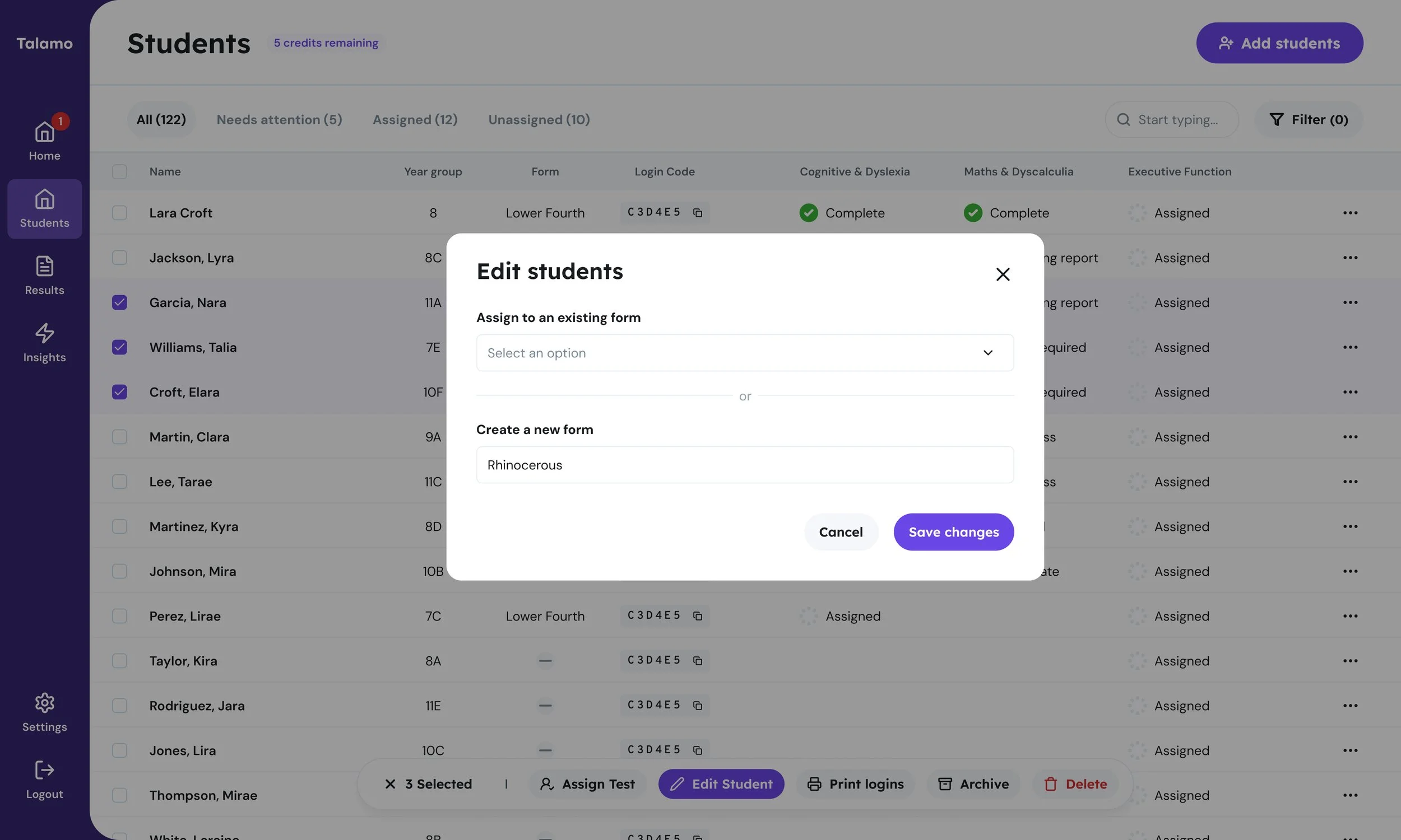
Add ‘Form’ flow - Create Bulk Edit and Single Edit UI flows for assigning a form group encompassing a drop-down of the school's existing Form values plus free-text input.
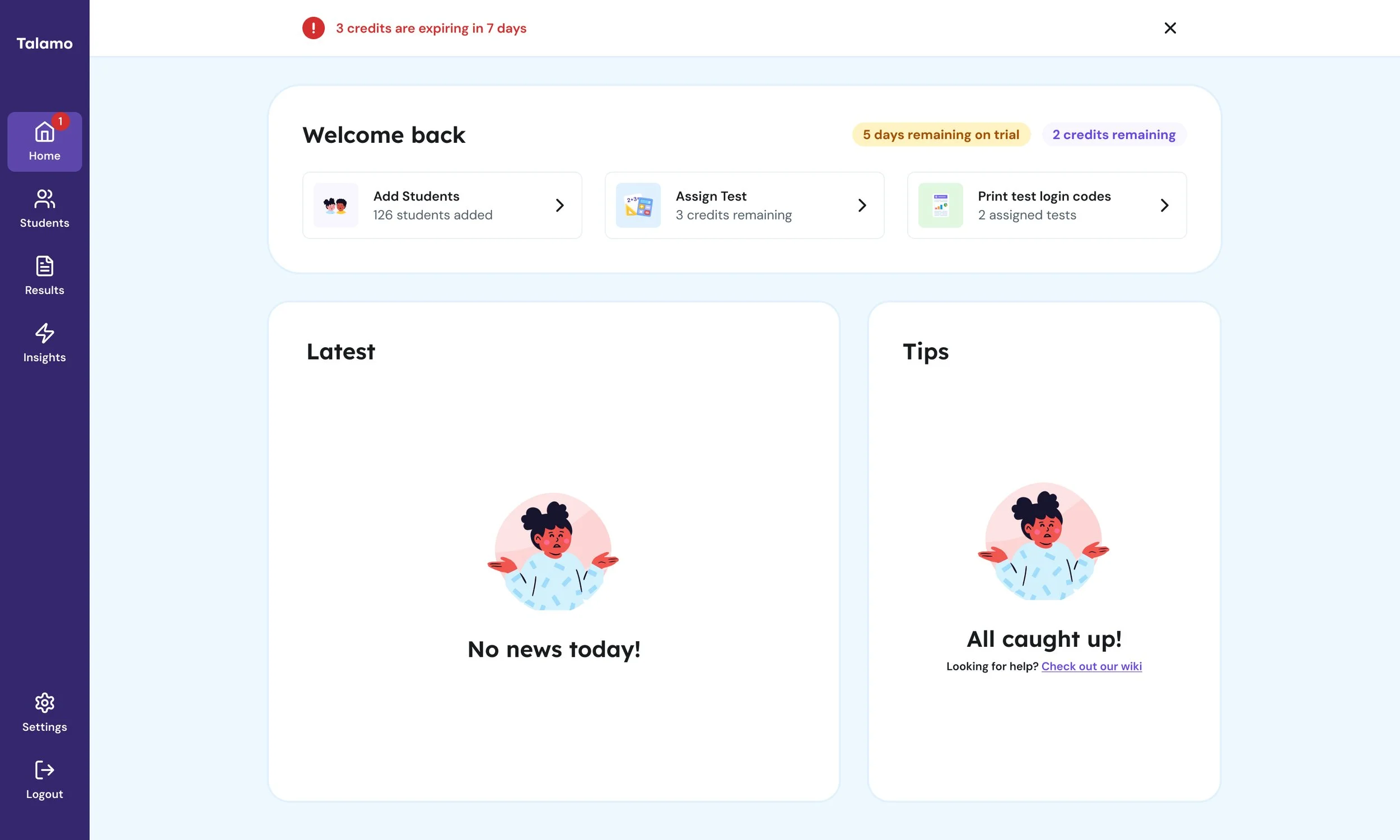
Dashboards - Develop UI for ‘New User’ and ‘Returning User’ dashboard states with dismissable information adding user specific features such as a behaviour-triggered tip card shown when the school meets a specific condition.
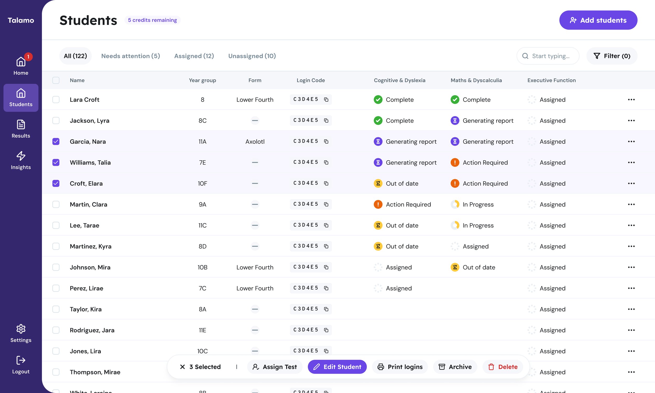
Insights report - Create flows for insights report page including a bulk action on the Floating action bar plus report is disabled flow while none of the selected students has a completed test.
Challenges
Joining the project at Phase 2 meant quickly familiarising myself with an established UI and design system, while working towards a five-week launch deadline. Adapting and evolving existing components was a new area for me, so I had to get up to speed quickly—understanding how the system worked, where existing patterns could be reused and when components needed to be adapted to support new functionality.
Takeaways
This was my first experience working on a SaaS product. My previous experience working with clients and stakeholders meant I was comfortable getting up to speed quickly, working closely with the Design Lead and asking the right questions to understand both the product and the team’s way of working. This helped me build confidence in the process, establish a collaborative relationship and contribute effectively as the project progressed.
Working from product requirements and existing the exisitng framework, I translated new features into clear interfaces. This involved adapting and developing the design system and considering how each new interaction fitted into the wider experience, while maintaining consistency with the established product.
I worked collaboratively with the wider team to review requirements and map out the structure and hierarchy of each screen before developing the visual design, considering how information should be prioritised and how users would move through more complex tasks and screening journeys. Particular attention was given to making content easy to understand and interactions feel straightforward, given the nature of the product and its users.
Components and interaction patterns were reused and evolved where possible, helping create a more consistent experience while allowing the product to scale as new features were introduced.
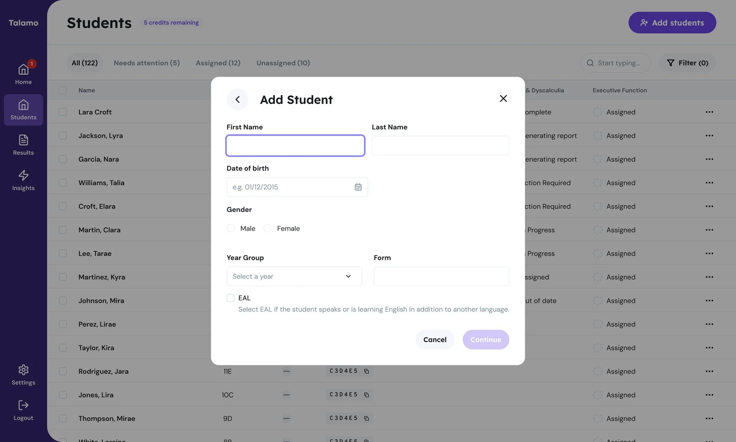
The final designs covered a range of interfaces, from dashboards and information-rich screens to focused modal interactions, providing the UI foundations for the Phase 2 rollout.
Interested in working together?
With a background spanning e-commerce, SMEs and CMS platforms, plus experience working with SaaS products, I’m as comfortable getting into the details of a design as I am stepping back to understand the bigger picture. I enjoy working collaboratively, building strong relationships with stakeholders and creating solutions that work for both users and the business.
I’m currently looking for UI/ Product design opportunities.